Thursday, February 04, 2010
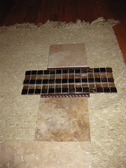
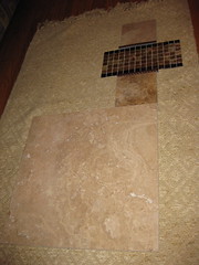
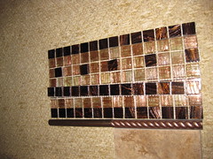
More accurate light angles of the tile colors
This one shows the differences between the lighter and darker main tiles
better than the other pics.
better than the other pics.
Big picture look
At the bottom of the pic is the flooring choice. This is set in stone- haha,
I am using Travertine that I am in visual lust with. The subtle color
nuances and gentle organic swirls thrill me to no end. I asked DH if he was
in love with it as much as I, and he said, "I don't think that's possible,
though I do like it" or something close to that.
Moving up is the tile that is a darker gradation. I am using the art
principles of value, being the lightness and the darkness of an object and
giving the lower portion of the tile, which will be above the bathtub a
darker color than the rest. There will be a well-proportioned amount of that
tile, about a 1/3 ratio, then the scrolly transitions, then the glass tile
motif, and more scrolly transitions, then above that a lighter tile color.
This way the heavier color is at the bottom since it has more weight than
the lighter color which will be at the top.
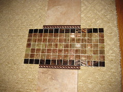
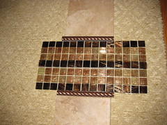
So the voting is for the glass tile motifs, as I have selected the flooring
and the other 2 main tile colors. I don't want it to be too busy, but I
don't want it to be to boring/safe. I want it to be artsy but relaxing. DH
likes symmetry, as do I.
So, cast your votes!!!!
1, 2, or 3!
Option one
There are endless config's available for tile. I know because I have sat in
front of the fireplace till the wee hours of the night just playing around
with options. My goal is a look that is high-end, but I have a tendency to
select the more "out there" look over the conservative, traditional look.
This is for our bathroom, which is going to be spa--like instead of retro
peach and black soon.
Please vote for the most appealing tile configuration- and then I can make
my ultimate decision.
Subscribe to:
Comments (Atom)
